Hello There!

Lorem ipsum dolor sit amet, consectetur adipiscing elit,

Follow Us

Re-Search & Ignite

ABOUT PROJECT

Re-Search & Ignite is a research and consulting company built on over 20 years of market research expertise. The brand helps organizations transform data into actionable strategies by combining AI-powered intelligence with human-driven insights. Their services include Customized Research Solutions, Market Segmentation, Prospect & Customer Database Management, and Consulting Services.

The company’s vision is simple : to transform raw data into meaningful strategies that ignite growth.

Challenge

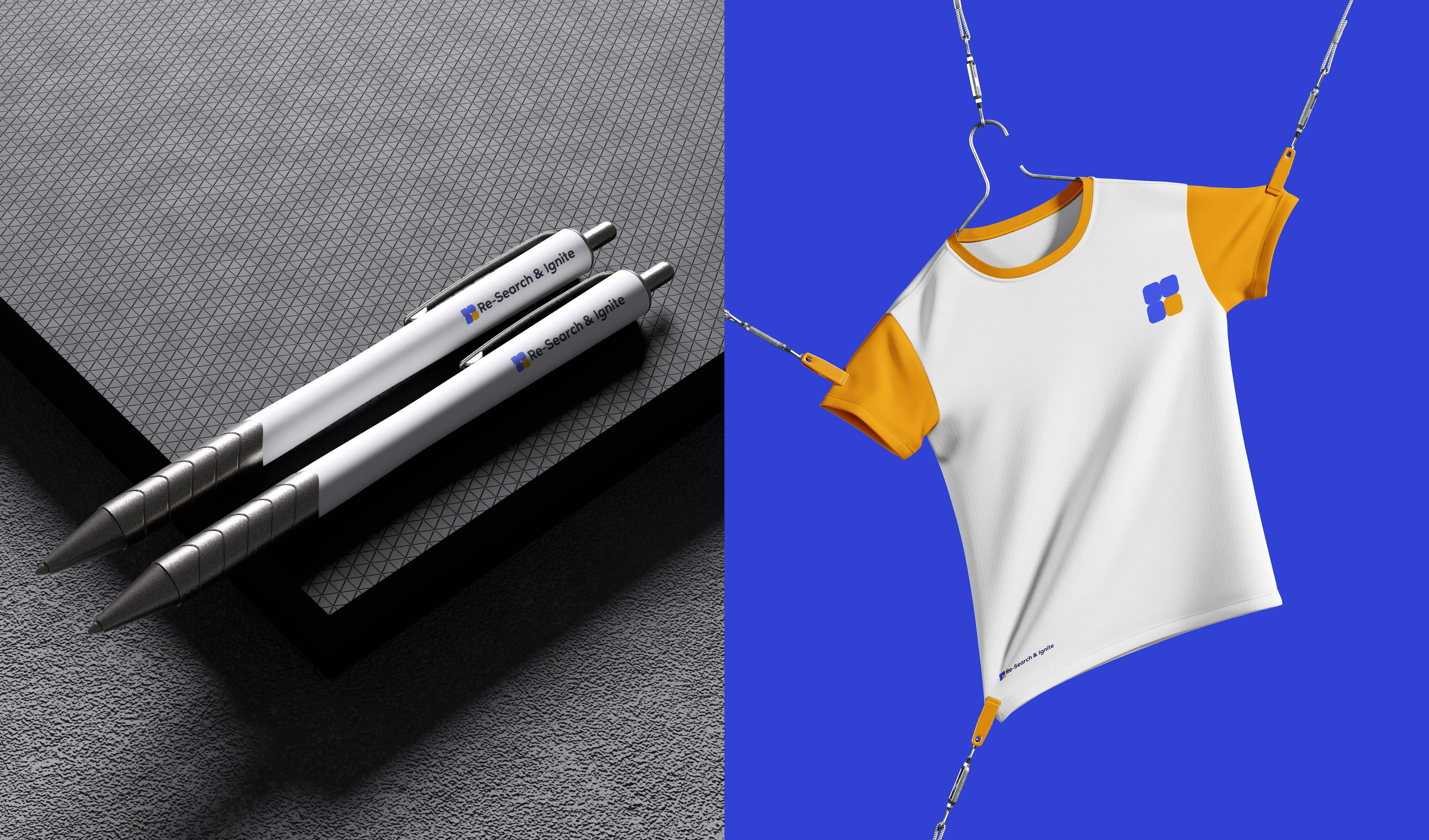
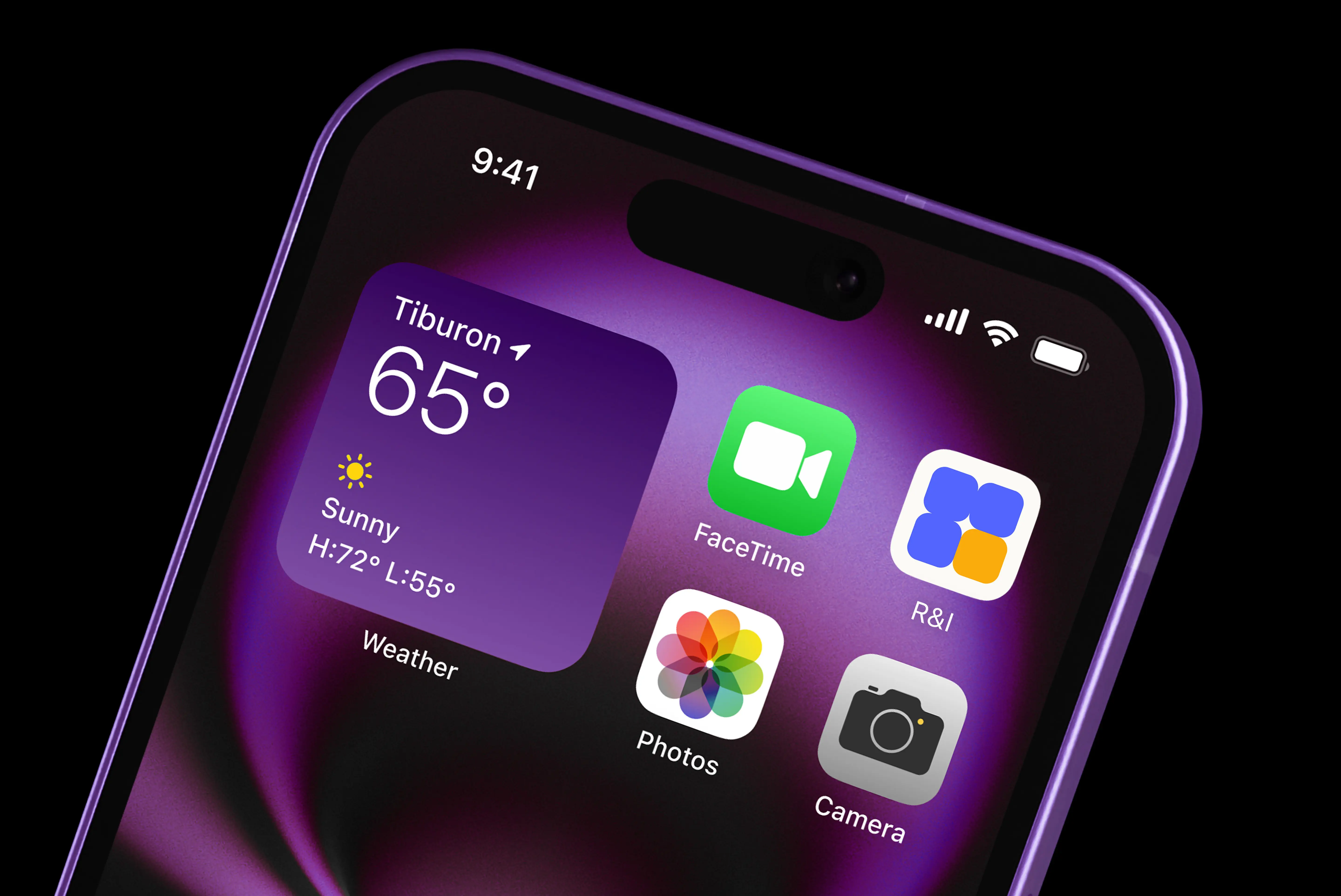
When the project began, Re-Search & Ignite was a new player in the consulting space. The company had a strong mission but lacked a visual and verbal identity that could clearly express its purpose. The challenge was to:

Create a brand identity that reflects structure, clarity, and professionalism while also showcasing the spark of innovation.

Differentiate the company from large competitors who focus on scale rather than personalized service.

Develop a consistent visual language and system adaptable across presentations, digital platforms, reports, and social media.

Build a brand voice that is empowering, insightful, and modern.

Solution

The new branding system successfully positioned Re-Search & Ignite as a modern, insightful, and trustworthy partner, leading to several key outcomes. At its heart is a distinctive logo that clearly reflects the brand's duality of structured research and creative insight. This is supported by a versatile color palette and a clear typography system, which enhance professionalism and allow for creative storytelling across all platforms. By deploying these elements across its digital presence on LinkedIn, social media, and presentations, the brand now communicates with greater clarity and authority. As a result, the project has garnered positive client reception and given the company a stronger ability to stand apart from its large-scale competitors.

2x2 square grid symbolizing structure, data cells, and clarity. The single yellow square represents the “ignite moment,” bringing energy and creativity into structured research. Clean, geometric, and highly versatile — this option best captured the brand essence and was selected as the final logo.